
What Colours and Fonts Should a Toronto Brand Use to Look Professional?

If you’re wondering what colours and fonts your brand should use to look professional in Toronto, you’re asking a question that directly impacts how customers perceive your business—often within seconds.
Branding isn’t just about looking good. It’s about communicating trust, clarity, and credibility instantly. In a highly competitive market like the Greater Toronto Area, your visual identity can either position you as a serious business—or make you blend into the background.
The truth is, there’s no single “perfect” colour or font. But there are proven principles that professional brands follow consistently.
Let’s break them down.
Why Colours and Fonts Matter More Than You Think
Before someone reads your website or understands your offer, they see your brand.
Colours and typography create a first impression that influences how people feel about your business.
Do you look trustworthy?
Do you look modern?
Do you look established?
In cities like Toronto, where consumers have endless options, these visual cues help people decide quickly whether to engage—or move on.
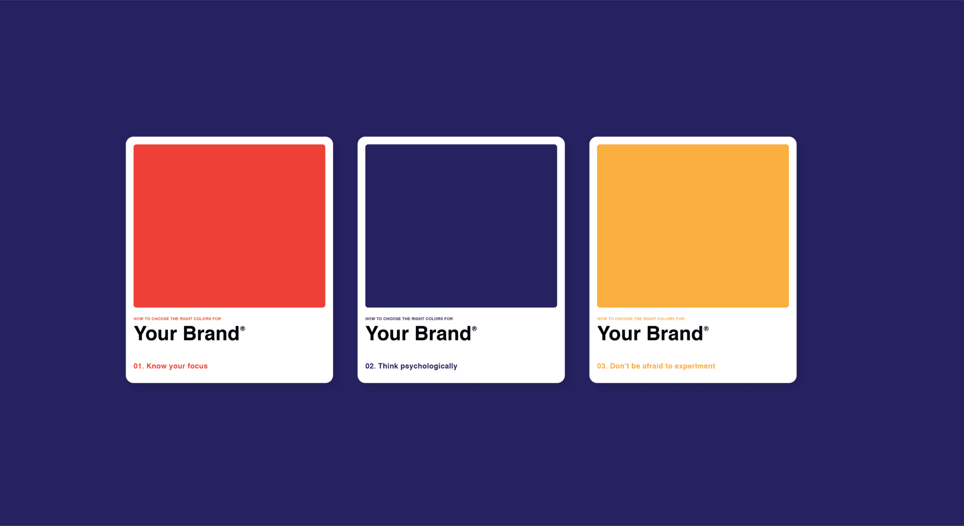
The Best Colours for a Professional Brand
Professional brands don’t choose colours randomly. They choose colours that align with psychology, industry standards, and their target audience.
Blue: Trust and Reliability
Blue is one of the most widely used colours in professional branding. It communicates trust, stability, and professionalism.
That’s why many corporate and service-based businesses use it. If your goal is to build credibility quickly, blue is a strong choice.
Black and White: Simplicity and Authority
Minimalist colour palettes using black and white often feel premium and timeless.
These colours are especially effective for brands that want to appear modern, clean, and sophisticated.
In competitive markets like Toronto, simplicity can help you stand out more than overly complex designs.
Green: Growth and Balance
Green is commonly associated with health, sustainability, and growth.
It works well for businesses in wellness, finance, or eco-friendly industries.
Red: Energy and Attention
Red is bold and attention-grabbing. It creates urgency and excitement.
However, it should be used strategically. Too much red can feel overwhelming, but used correctly, it can highlight key elements like calls-to-action.
Neutral Tones: Modern and Versatile
Beige, grey, and muted tones are increasingly popular in modern branding.
They create a clean, professional look while allowing other elements—like typography and imagery—to stand out.
How Many Colours Should You Use?
One of the biggest mistakes businesses make is using too many colours.
Professional brands typically stick to:
One primary colour
One or two secondary colours
One accent colour
This creates consistency and makes your brand more recognizable.
Consistency is what builds trust over time.
The Best Fonts for a Professional Brand
Just like colours, fonts communicate personality.
The right typography makes your brand feel clear, modern, and credible. The wrong choice can make it look outdated or unprofessional.
Sans-Serif Fonts: Clean and Modern
Sans-serif fonts are widely used in modern branding because they are simple and easy to read.
They work well across websites, social media, and mobile devices.
Common examples include:
Helvetica
Arial
Open Sans
For many businesses in the Greater Toronto Area, sans-serif fonts are the safest and most versatile option.
Serif Fonts: Traditional and Established
Serif fonts have small details at the ends of letters, giving them a more classic and formal look.
They are often used by brands that want to appear established and authoritative.
Display Fonts: Use Sparingly
Decorative or display fonts can add personality, but they should be used carefully.
Too much creativity in your typography can reduce readability and make your brand look less professional.
Use them only for accents or headlines—not for body text.
Font Pairing: Keep It Simple
Professional brands usually use two fonts:
One for headings
One for body text
The key is contrast without conflict.
For example, pairing a bold sans-serif heading with a simple body font creates a clean, balanced look.
Avoid using too many fonts—it creates inconsistency and confusion.
Align Your Branding With Your Industry
Your colour and font choices should align with your industry and audience expectations.
For example:
A law firm in Toronto might use blue and serif fonts to communicate trust and authority
A creative agency might use bold colours and modern typography
A wellness brand might use green and soft, clean fonts
Understanding your market helps you make better branding decisions.
Consistency Is What Builds Professionalism
Here’s what most businesses get wrong.
They focus on choosing the “perfect” colours and fonts—but ignore consistency.
Professional branding is not about perfection—it’s about repetition.
Your colours and fonts should be consistent across:
Your website
Social media
Ads
Email marketing
In the Greater Toronto Area, where customers interact with brands across multiple channels, consistency is what makes your business feel established and trustworthy.
Common Branding Mistakes to Avoid
Many businesses unintentionally weaken their brand by making simple mistakes:
Using too many colours or fonts
Choosing trendy styles that quickly become outdated
Ignoring readability
Inconsistent branding across platforms
Avoiding these mistakes can instantly improve how your brand is perceived.
How Do You Choose the Right Colours and Fonts for Your Toronto Brand?
Choosing the right colours and fonts comes down to three things:
Clarity, consistency, and alignment with your audience.
Your goal is not just to look good—it’s to communicate professionalism and build trust instantly.
For businesses in Toronto and across the Greater Toronto Area, strong branding is what separates forgettable businesses from recognizable ones.
Key Takeaways
If you want your brand to look professional, focus on the fundamentals:
Choose colours that reflect trust and clarity
Stick to a simple, consistent colour palette
Use clean, readable fonts (preferably sans-serif)
Limit your typography to two fonts
Align your design with your industry
Stay consistent across all platforms
Professional branding isn’t about doing more—it’s about doing the right things consistently.
If you’re ready to build a brand that stands out and converts in the Greater Toronto Area, 93 Till Infinity Media is here to help. Visit https://93tillinfinitymedia.com to learn how we combine branding, SEO, and digital marketing to grow businesses.
Reach out today at 93tillinfinitymedia@gmail.com to create a brand that looks professional and performs.
FAQ
What colour is best for a professional brand?
Blue is one of the most effective colours for professionalism because it communicates trust and reliability.
How many fonts should a brand use?
Most brands should use no more than two fonts to maintain consistency and clarity.
Are serif or sans-serif fonts better?
Sans-serif fonts are more modern and versatile, while serif fonts feel more traditional and authoritative.
Can I use bright colours in my branding?
Yes, but they should be used strategically as accent colours rather than the main palette.
Why is consistency important in branding?
Consistency builds recognition and trust, especially in competitive markets like Toronto.