
What Makes a Logo Stand Out for a Mississauga Small Business?
If you are building a brand in Mississauga, your logo is not just a visual asset. It is a compressed version of your brand strategy. It signals credibility, communicates positioning, and influences how quickly customers recognize and trust your business.
In a dense and competitive environment like the Greater Toronto Area, where consumers are exposed to hundreds of brand impressions daily, a logo must do three things effectively. It must be instantly recognizable, easy to interpret, and consistent across every touchpoint.
The difference between a logo that blends in and one that stands out is not creativity alone. It is the application of design principles, cognitive psychology, and strategic positioning.
Key Takeaways
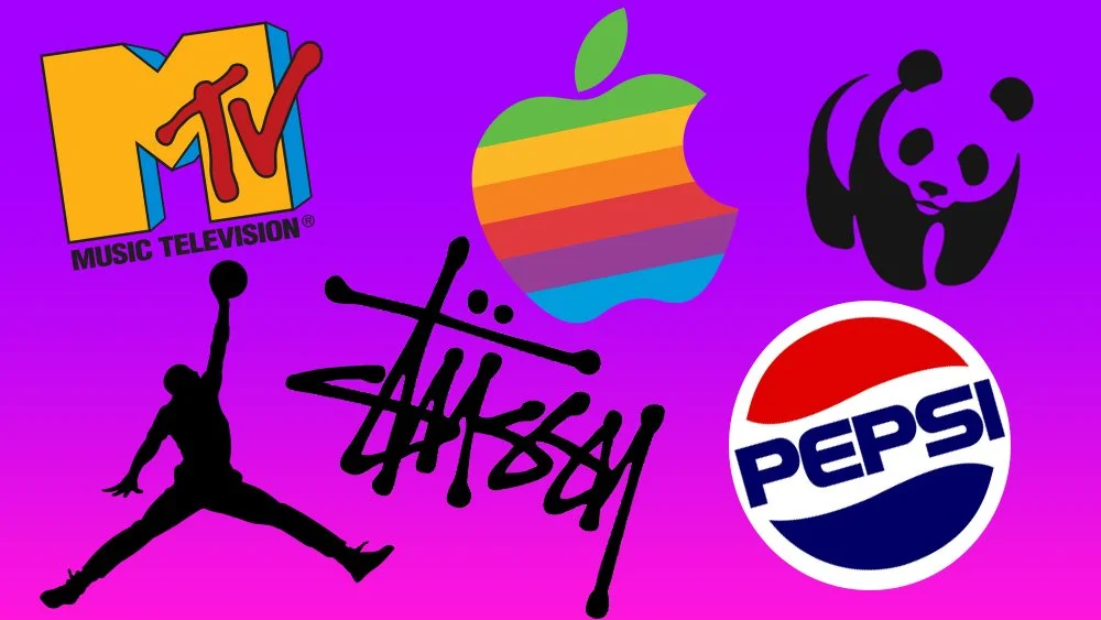
Logos that are simple, distinctive, and scalable are easier for the brain to recognize and recall
Typography and spacing directly impact perceived professionalism and trust
Color selection influences emotional response and brand positioning
Logos that align with a clear brand strategy outperform visually complex designs
Consistent use across platforms increases recognition and marketing effectiveness
Local context and audience expectations influence what “stands out” in Mississauga
A logo becomes valuable when it supports recognition, trust, and conversion across your marketing ecosystem.
The Psychology Behind Memorable Logos
To understand what makes a logo stand out, it helps to understand how people process visual information.
The human brain prioritizes simplicity and pattern recognition. When a logo is easy to process, it is more likely to be remembered. This is tied to a concept known as cognitive fluency, where simpler visuals are perceived as more trustworthy and familiar.
For a small business in Mississauga, this means:
Clean shapes are processed faster than complex ones
Balanced spacing improves readability
Minimal elements reduce confusion
A logo that can be understood in seconds has a higher chance of being recalled later.
Simplicity vs Complexity: Why Less Performs Better
One of the most consistent findings in branding is that simpler logos scale better across platforms.
A complex logo may look impressive in a large format, but it often loses clarity when:
Displayed on mobile devices
Used in social media profile icons
Printed in small formats
Simple logos maintain their integrity across all sizes and contexts.
For businesses in the Greater Toronto Area, where mobile usage dominates, this is critical.
Distinctiveness: The Most Underrated Factor
Standing out is not just about looking good. It is about being different in a meaningful way.
Distinctiveness is what allows customers to recognize your brand instantly among competitors.
This can be achieved through:
Unique shapes or symbols
Custom typography
Uncommon color combinations
However, distinctiveness should not come at the cost of clarity. The goal is to be recognizable, not confusing.
Typography: A Core Driver of Brand Perception
Typography is one of the most influential elements in logo design, especially for service based businesses.
Fonts communicate tone and positioning. For example:
Sans serif fonts often feel modern and clean
Serif fonts can feel more traditional and authoritative
Bold fonts convey confidence and strength
For small businesses in Mississauga, typography should prioritize readability and consistency across digital platforms.
Customizing or slightly modifying a font can also improve uniqueness without sacrificing clarity.
Color Theory and Brand Positioning
Color is not just aesthetic. It is functional.
Different colors trigger different psychological responses.
Common associations include:
Blue for trust and reliability
Black for premium positioning
Green for growth or sustainability
Red for urgency and attention
The key is consistency.
Using a consistent color palette across your logo, website, and marketing materials strengthens brand recognition over time.
In a diverse market like the Greater Toronto Area, color can also influence how your brand is perceived across different audiences.
Scalability and Versatility
A high performing logo must function across multiple environments.
This includes:
Digital platforms
Print materials
Signage
Merchandise
To achieve this, your logo should exist in multiple variations:
Full logo
Icon or symbol
Monochrome version
Testing your logo in different sizes and formats ensures it remains effective in real world use.

The Role of Brand Strategy
A logo cannot stand out without a clear brand strategy behind it.
Before designing a logo, a business should define:
Target audience
Brand positioning
Core message
Competitive landscape
For example, a luxury service in Mississauga will require a different visual identity than a budget focused service.
The logo should reflect this positioning clearly.
Without strategy, even well designed logos fail to connect.
Local Context: Why Geography Matters
What stands out in one market may not stand out in another.
Mississauga is part of a highly competitive and diverse region. This influences design trends and expectations.
Local considerations include:
Industry saturation
Cultural diversity
Consumer preferences
For example, overly generic corporate logos may blend in, while distinctive and modern designs may attract more attention in certain industries.
Understanding your local audience helps refine your visual identity.
Consistency and Brand Recall
A logo does not become recognizable overnight.
Recognition is built through repetition.
Consistent use of your logo across:
Social media
Website
Advertising
Packaging
…reinforces familiarity.
Over time, this familiarity builds trust, which directly impacts conversion rates.
For businesses in Greater Toronto Area, consistency is one of the most overlooked advantages.
Common Logo Mistakes Small Businesses Make
Many logos fail not because of poor design, but because of strategic mistakes.
Common issues include:
Overcomplicating the design
Following trends instead of building a timeless identity
Using inconsistent fonts and colors
Designing without a clear target audience
Ignoring scalability and usability
Avoiding these mistakes improves both short term perception and long term brand value.
What Makes a Logo Stand Out for a Mississauga Small Business?
A standout logo is not defined by how creative it looks. It is defined by how effectively it communicates and performs.
For businesses in Mississauga, the most effective logos are those that:
Are simple enough to be recognized instantly
Are distinctive enough to stand apart from competitors
Are aligned with a clear brand strategy
Work consistently across all platforms
When these elements come together, your logo becomes more than a design. It becomes a competitive advantage.
If you want to build a logo and brand identity that is designed for recognition and growth, 93 Till Infinity Media can help. Visit https://93tillinfinitymedia.com to learn how we help businesses in the Greater Toronto Area develop branding systems that support marketing and long term success.
Reach out today at 93tillinfinitymedia@gmail.com to create a brand that stands out and scales.
FAQ
What makes a logo effective for small businesses?
An effective logo is simple, recognizable, and aligned with the brand’s positioning and audience.
How important is branding compared to logo design?
Branding is more important. The logo is one part of a larger system that includes messaging, visuals, and customer experience.
Should a logo follow design trends?
Trends can help with relevance, but timeless design is more important for long term recognition.
How many colors should a logo use?
Most effective logos use a limited color palette to maintain consistency and clarity.
Can a logo impact customer trust?
Yes, a professional and consistent logo can significantly influence how trustworthy a business appears.